Viz
The following provides some examples of patch visualization. See the viz module documentation for a list of visualization functions
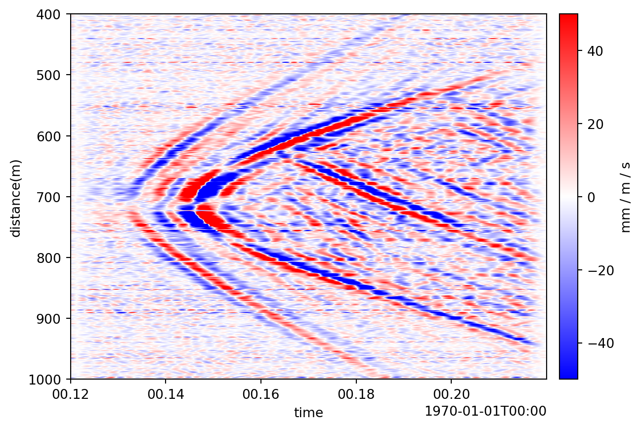
Waterfall
The waterfall patch function creates a waterfall plot of the patch data.
import dascore as dc

patch = (
    dc.get_example_patch('example_event_1')
    .set_units("mm/(m*s)", distance='m', time='s')
    .taper(time=0.05)
    .pass_filter(time=(None, 300))
)
patch.viz.waterfall(show=True, scale=(-50,50))
<Axes: xlabel='time', ylabel='distance(m)'>
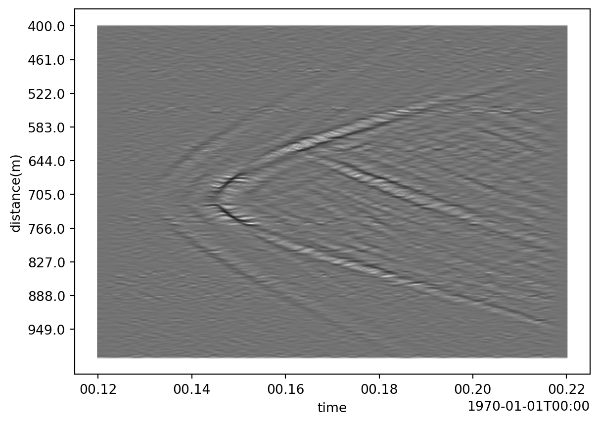
wiggle
The wiggle patch function creates a wiggle plot of the patch data. We’ll use the same patch as above to model this function.
import dascore as dc

patch = (
    dc.get_example_patch('example_event_1')
    .set_units("mm/(m*s)", distance='m', time='s')
    .taper(time=0.05)
    .pass_filter(time=(None, 300))
)
patch.viz.wiggle(scale = .5)
<Axes: xlabel='time', ylabel='distance(m)'>
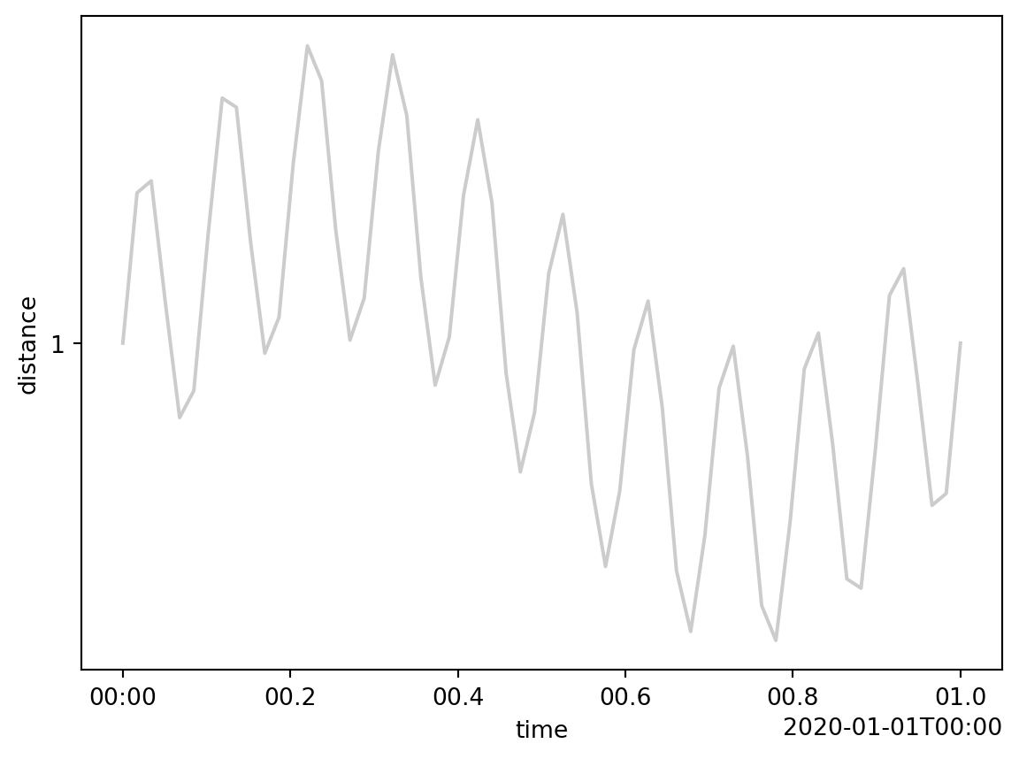
Another example using wiggle to plot a sine wave is demonstrated below.
import dascore as dc

patch = dc.examples.get_example_patch(
    "sin_wav",
    sample_rate=60,
    frequency=[60, 10],
    channel_count=1,
)
patch.viz.wiggle(show=True);